
In this episode, the Ninjas get caught up on the last of the artwork put forth for critique by the brave and bold.
Join Patrick, Socar, Drew, Ralph, and Jeremy as they learn why the word "cuirass" is ripe with comedic potential.
http://mchughstudios.com/ninjamountain_podcast/episode47.mp3
Subscribe on iTunes, for free. Or we'll throw a scalpel at your cuirass.
Many thanks to Drew Baker and Ralph Horsley for their helpful paint-overs.
Here are the entries along with the paint-overs offered as suggestions to the artists.
Thank you all for participating!
Angela Sasser ( aka "Angelic Shades" )
To see a paint-over by Drew, check out the following link.
Chris Griffin (aka "Quickreaver")

To see a paint-over by Drew Baker, check out the following link.
Seth Rutledge ( aka "eldritch 48" on twitter)
To see Drew's paint-over, check out the following link.
Simon Anderson-Carr (aka "Scarrart")

To see Drew's paint-over, check out the following link.
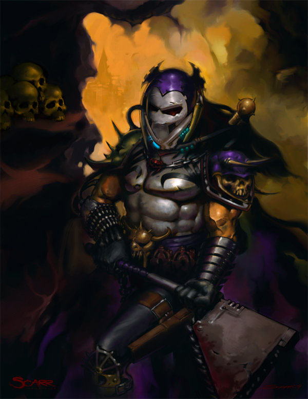
Marjon ( aka "sirithduriel")

To see Drew's paint-over, check out the following link.
Elin Joseffson
To see a paint-over by Drew, check out the following link.
To see a paint-over by Ralph Horsley, check out the following link.
Drew has also made available his paint-overs with layer information intact as Photoshop files for download in zip format at the following link.
27 comments:
Ill be listening to this tonight. Should be good.
I also posted critiques for people who left links in last weeks posts: http://ninjamountain.blogspot.com/2010/01/ninja-mountain-46-critique-that.html
Aaah, awesome! I need to study today, but I'll listen to this in the evening. :)
Or I won't. Sorry for the doublecomment, but the mp3 link is probably broken. Only 3 kB filesize.
Oh, well, maybe it's still being uploaded.
Thanks for posting the real link, @sirithduriel. I was about to get all outraged an' stuff.
There we go - link fixed. My fault everyone, not Jeremy's! :) I'll be gone for the day so everyone play nice. :D
-Patrick
Yaaay! Lets throw explicits about with wanton abandon!:)
Thanks in advance, guys! I'll be listening to the podcast tomorrow...today is chockfull of company and outtings. Extra kudos to Drew for the paintover! Can't wait to be humbled, to rise from the ashes like a phoenix...*cough cough*
James Gurney has a very interesting post on his blog:
http://gurneyjourney.blogspot.com/2010/01/automated-painting.html
If I may, I would like to ask the Ninjas a question (you could maybe talk about it on the next show if you find it interesting/discussable enough).
Corel Painter has been trying to do this for quite a while, but the results haven't been as good as this.
Would you ever use a "filter" like this?
Maybe for making quick underpaintings from reference photos?
For backgrounds?
Would it mean cheating and betrayal of true art, or would you be benevolent and see it as a form of using reference?
(although it's not technically a filter, it must be super complex and I would very much love to see the design document or the code)
Holy crow, Jan! This scares me a little. Talk about further devaluing the worth of a digital artist...
Nah, I think we're safe. ;) It can only repaint something that already exists. So crazy fantasy images still require an artist's imagination.
But sure, this would work for realistic images or as I said - underpaintings.
Thank you Ninjas!
I will defenatly have all of the things you talked about in mind when finishing this picture.
I would like to mention that I am using a photo of a friend as a reference already. What I think is the biggest problem with the legs is that I used a flash, and the light makes it difficult to work with that leg.
I will post a link when I am finished with it.
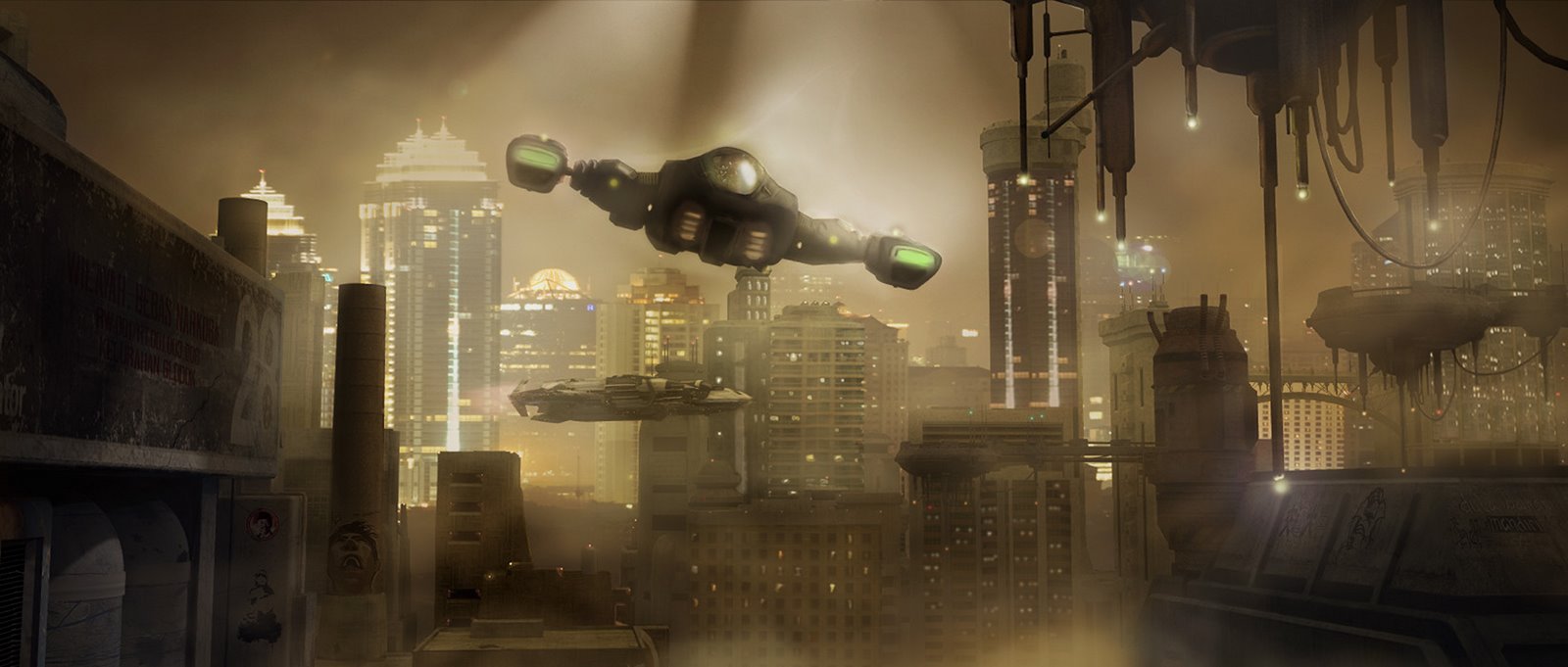
Thanks for the great critique guys! Bit of background - The image was for a matte painting challenge, which was why the background was meant to be the focus. It was made as a combination of 3d and photography, with the background image being a night shot of Jakarta that I took in 2007. The FG vehicle is flying towards the audience, there actually are very faint trails behind it, but the smoke/smog overpowers them.
Because the perspective was based on a photo, there wasn't a lot I could do on the angle, but I definitely agree that tremendous use of verticals is problematic.
As a matte painting concept, I struggled with how much FG detail to put in, and decided to leave the left side of the frame less busy to focus more attention on the BG....which may well have been a mistake.
Again, I don't want to sound defensive, I absolutely agree with your comments, and thanks very much for spending the time to take a look at it!
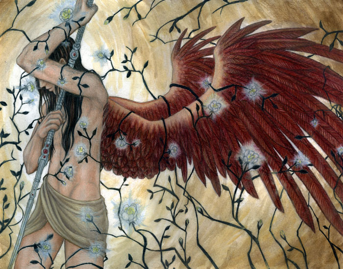
Finally got around to listening the the critique, gang! My piece was a WIP, so the 'jewelry' bits and tattoo and wings weren't finished...you guys picked that up, obviously. (Maybe it should've been a little more polished before I submitted it.) But now I get to work on those aspects, with all the keen advice. Socar was right; it's a pin-up. (I'll give you the naughty bits next time!) Y'all can put whatever context into it you wanna. I've always dug the juxtapostion of good with bad, hence the 'dirty angel' vibe.
My apologies to Patrick for having peeked into the shower to copy his anatomy...you could ALWAYS send photos next time, yanno!
Thanks again for the advice. It was a total treat!
Chris - and all the other wonderful artists who participated this week and last - I just want to say again thanks to YOU for joining in!
Beyond giving us the chance to see all of your work, it was a good opportunity for everyone to really get involved in in-depth, constructive critiquing. Both us, as a panel, being forced to really think things through in front of both our peers AND thousands of listeners, and for the audience, many of whom haven't really had the chance to participate in real crit sessions like this.
So often on the internet "critiques" are really just complaints or insults or negative reactions. We really enjoyed the chance to show off how much of a positive and helpful experience it can be. And we hope we did!
Also - THANKS to those who are posting their pieces for critique and those who are responding, right here in the blog. This is great stuff! I'm having fun looking at the pieces, and reading the crits being offered. I'll hop in and do a couple myself soon.
-Patrick
Hello Ninjas! I just wanted to say thank you for the wonderful critique. Uriel is a piece I've been wanting to redo for ages and I will definitely have your advice in mind when I take on this great challenge. Your crits have nudged me towards the decision to redo it digitally where I can play with deep contrasts and glowing flowers more easily. I hope also to bring more of the archangel's narrative into a newer rendition.
Also, I wanted to thank Ralph for the absolutely wonderful reading of my artist's comment. You have a wonderful voice.
I will also remember the tips for applying masking fluid. Urm...and toothpicks XD
I think there's a HUGE difference between critiquing a piece in text vs. a 'live' discussion. It's so much more fluid and easy and immediate to just speak! And you get to bounce ideas off your fellow critics right there, in the moment. It becomes more of a discussion and list of stuff. Again, I thank you all. I laughed, I cried, I learned!
Google imaging lots of old master painting of Adam and Eve, they all seem to have navels. I can't find one that doesn't, actually. I wonder where that old chestnut about it being an artistic convention not to give them belly-buttons came from. I've heard it before but it was clearly never the case.
Gordon: That's interesting. I heard it on one of my art history classes. The teacher had a photo up and asked who the figures where. When no one knew she told us we could tell they were Adam and Eve, as they had no navels. I don't remember what the painting was, though.
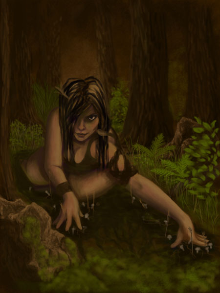
sirithduriel: I'm pretty sure the bubbles comment was mine. I had a couple of things in mind:
My main thought was that if you put the creature under water in a convincing way -- if you sell the environment -- then the viewer will simply understand those slits are gills. It will be a natural conclusion.
(It's kind of like the advice always given to writers: show, don't tell.)
Second, I'm pretty sure normally functioning gills don't produce visible bubbles -- so the bubbles are a little counter productive. If you want your creature to expel bubbles I think you'd be better off inventing some other breathing apparatus.
--Drew
You know, I have not heard of the no-navel thing either, but thinking about it from a mythological point of view, angels (and Adam and Eve) are assumed to have never been born in the traditional fleshy fashion. It makes perfect sense to me that they would have no navels.
I admit, Uriel not having a navel was a pure accident, but I enjoy the inadvertent symbolism of it.
I am glad that the critique was interesting and useful. I certainly enjoyed particpating. Oh, and Angela - I'm pleased you liked the reading :)
Totally off topic question here. I am, Michael Stubbs, one of the collectors from Illuxcon and have been listening ever since. So, if I were thinking of getting a Wacom tablet, would you recommend a Bamboo or an Intuos and is a medium sized one worth the extra $150 over the small one?
also, how does one find the first 25 or so episodes?
Hi Lavron - I'd go for the Intuos if you have the extra money. It's got more features and more sensitivity. The size is hard to recommend, though. It really depends on how you work - do you move your hand around or not when you write or draw? I use a 6 x 11 on a two-monitor setup, which is a lot like the smaller tablet size. But some people really need to sweep their arms around!
To find earlier episodes, just look at the archives on the left of this page! We started in late January of last year, and if you open January 2009 you'll find the first episode, and you can move on from there.
In case you're interested, here's my brief history of the early months of the show:
http://megaflowgraphics.blogspot.com/2009/05/ninja-mountain-awful-terrible-truth.html
Michael: As Patrick said, finding the right size depends a lot on how you work (and sometimes desk space). I have a 6x11 Intuos3 I can let you try out if you'd like. Drop me a line: drew@drewbaker.com
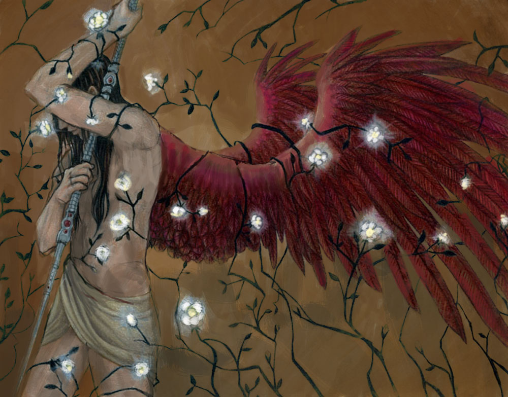
I completely forgot to mention in a previous comment that I *have* reworked Uriel a few times since the image I sent you guys. These WIPs are a couple of years old now and definitely need to be updated for my current anatomy & skill level, but thought I'd post it for the curious!
Uriel(take 2!) - http://fav.me/dawwf9
More setting included, more centralized composition, different angle on face while still keeping the obscured face theme.
Uriel (Gender Bended Redesign!) - http://tinyurl.com/ydx7ry5
Overhauled outfit/chara design, more focused roses & vines
Would love to hear your thoughts on these revamps!
Here is the finished painting. I tried to take what you told me in concideration but still keeping to my vision. I also lost interest in it at the end, otherwise I might have polished it a bit more.
http://quilde.deviantart.com/art/Fae-of-death-150709628
@Ninjas. I just got caught up on the shows-wow, the ninjas have stayed prolific, even through the holidays. My wife and I have had insane deadlines since October and we have a little problem with saying "no" to decent jobs so, we are both stacked up beyond belief. I thought it was funny that I got a mention, and she giggled out of her chair (I have a bit of a reputation for intellectual douche-baggery in my own circles...but I promise...you would have a beer with me in real life and you would like it). Anyway, funny that I'm still thought of as the troll under the bridge. I'm beginning to look like one with 18-hour art marathons.
@Socar-you HAVE offended me! 'Won't date baldies, huh? Indeed! What if I had a rat on my shoulder and doused myself in India Ink with porn running in the background?
@Jan, I got into a verbal fight with one of these wonderboy algorithm cheerleaders before. It all comes down to the fact that art separated from the filter of human experience is not really art. It can still be interpreted that way. The same way that a rock formation or a cloud can look like a wonderous sculpture of a monkey, but it's not art. Here are snippets from two popular definitions: "Art is the process or product of deliberately arranging elements in a way that appeals to the senses or emotions." AND "Art is created when an artist creates a beautiful object, or produces a stimulating experience that is considered by his audience to have artistic merit." A machine cannot have human emotion...ever. You could program every iteration of a human emotional PATTERN or create a pale copy of the PROCESS, but it will never be as flawed and random as a human mind. That's right. It's the flaws in visual interpretation that sometimes invent style or create a piece that speaks to us.
Why not simply take the time-tested definitions literally? One thing-one chasm-betwixt us illustrators and fine artists is the "valley of bullshit" that is heaped on what they do to add value. I known a lot of fine art (because I know the artists behind it) to be knee-jerk, take less time than [my] illustrations and less thought, but the general NOTION is that fine art is more thought intensive, and more technically refined. This was once true but no longer the given rule. Point being...the difference between fine art and illustration is, one is primarily narrative and one is unbound and open more to abstraction. The rest, much like the idea that machines can be artists, it bullshit for the valley.
Now, an artist using that tool to make underpaintings? Then it becomes an advanced and speeded form of "Painter" with even less thought behind it, but with the possibility of creating a favorable result. I foresee a sad day if the vile slime of biomass (aka, grabbing usurpers of intellectual property rights) gets their way and can grab a photographer's photo, grab the algorithm (because code is int. property too, don't forget) run it over the photo and grab a job from a legit illustrator because the under-experienced art director who's only ever worked with stock anyway, won't know the difference. All with 0 talent. That is not the world I want to live in and it's not only because of my own self interests. We should be moving toward a meritocracy, where the talented are compensated to create superior work. Instead we are heading into the wild web, where beleaguered artists are ripped off every day by the untalented biomass which oozes sludge and seeks to make money from our work, much more than to teach itself thought or art.
Post a Comment