In this week's episode Drew, Patrick, Socar, and Jeremy discuss their use of the secretive discipline of sketching for fun, profit, and sanity...
The sketches and their progeny for your viewing pleasure...
Patrick's sketches:
You may recall the confusion we shared over which sketch I was describing...
I was talking about these sketches---
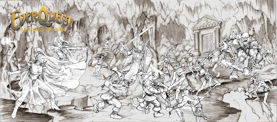
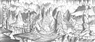
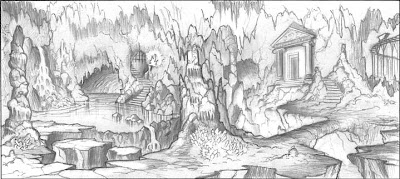
Patrick was actually talking about these lovely pieces of work!

 It eventually led to this most excellent finished illustration:
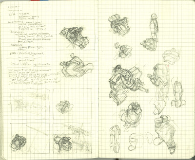
Here are Drew's sketches for your viewing pleasure. His thumbnails are a great way to tackle tough assignments!
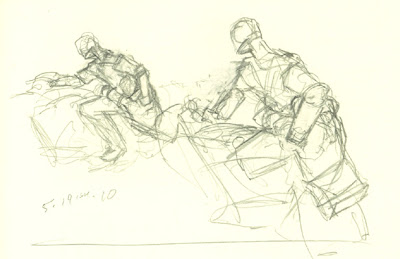
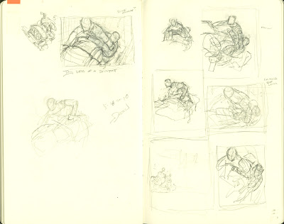
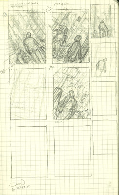
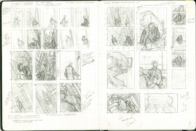
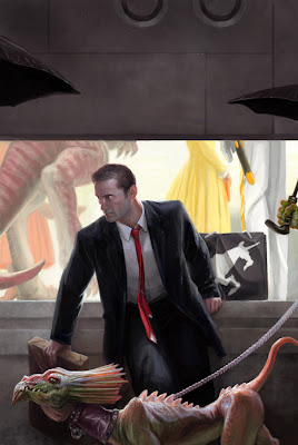
Below is the finished Einhorn piece based on the man sketches that Drew developed.
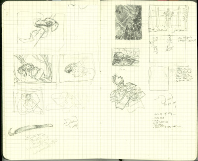
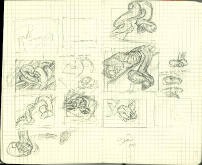
Below are sketches for a piece of card art featuring a large serpent.
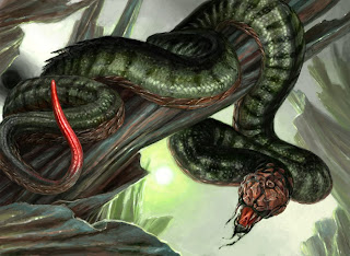
And the finished piece based on the many sketches the artist produced as he wporked out the composition...
Here is Socar's contribution to the discussion. We can't wait to see the finished piece when she can share it...
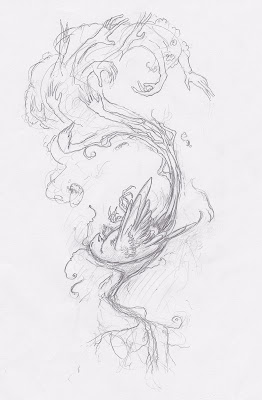
Here are a few pages from Jeremy's sketchbook. You can see what he means by using it for his own entertainment...
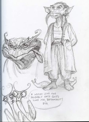
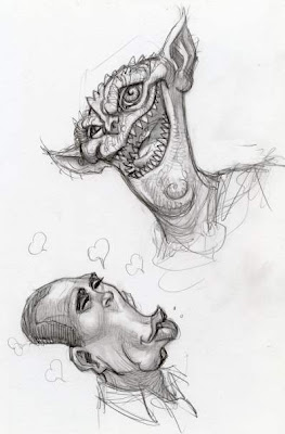
Jeremy does sketch for his contract work as well. Thumbnails are usually scanned into the computer and refined to roughly what you see here...
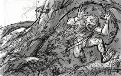
After about five minutes extra work Jeremy delivers this to the client...
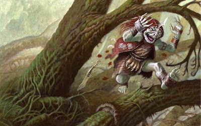
The same routine was followed for this second assignment as well...
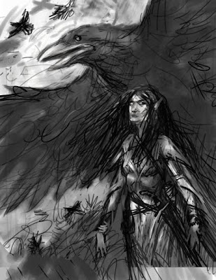
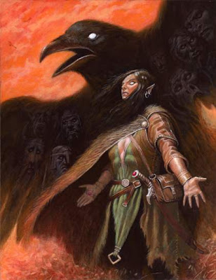
I think this one took ten extra minutes of work to finish after the rough was approved.
Jeremy stopped for a coffee....
If you keep a sketchbook, we hope you will share a few pages with your fellow listeners here in the comments section!
Don't forget to check out the Visual Artist Podcast Network for other great shows!
See you next week!
10 comments:
I can't click them thumbnails to see the large awesomeness! :(
(although from the thumbs it seems Jeremy keeps levelling up. Seriously, dude!)
Jeremy is indeed getting better in leaps and bounds.
My sketches often depend on the client. If the AD is just the owner or they're new to the whole thing, then I'll make a more detailed and clear sketch. Usually I'll send fewer sketches to these clients so that I can ensure a good option is picked.
I did some work for Jon a while back and since he's an artist and experienced, I sent him a lot of really rough sketches for one brief.
If I'm working with someone who is doing art by committee then I'll often send tighter sketches just because they often take too long to respond with feedback on the sketches. So I hope to save time by sending a sketch that I can begin rendering once they've responded.
These sketches are awesome!
I love that ya printed out a roll of that crap receipt paper to draw on at work! Haha, I used to do the same thing when I was a waitress!
The thumbnails aren't linking to larger versions for me either, Jan. Here are mine:
http://www.DrewBaker.com/nm/snake1.jpg
http://www.DrewBaker.com/nm/snake2.jpg
http://www.DrewBaker.com/nm/DrewBaker-snake-final.jpg
http://www.DrewBaker.com/nm/rider1.jpg
http://www.DrewBaker.com/nm/rider2.jpg
http://www.DrewBaker.com/nm/rider3.jpg
http://www.DrewBaker.com/nm/einhorn1.jpg
http://www.DrewBaker.com/nm/einhorn2.jpg
http://www.DrewBaker.com/nm/DrewBaker-Einhorn-final.jpg
(Scanned at 125 dpi. The grid -- and dot grid -- is 5mm, for reference. I did a few other sketches for the riders, trying a portrait crop, but they were on loose paper and I can't find them. Sad, because they were my favorites.)
(Also, I agree about Jeremy's work.)
Thanks, Drew!
(The Einhorn piece is AWESOME, I love the subtle narrative bits.)
Weird question: do you guys ever add text or captions to your sketches? It's quite a common thing among people showing their sketches online, I especially noticed it on CA.org. And I find it quite annoying.
Every quirky punk girl you draw, or a Lovecraftian monstrosity, they all have to have a speech bubble next to them, saying "'sup?!" or "Derp!" or something "witty" like that.
I did it once or twice, because I hoped it would make my sketches cooler.
But it didn't.
Another good show. It can be guaranteed that a drawing attempted on nice expensive paper will screw up, but that a sketch started on the back of a dog-eared crumpled old bank statement will turn out to be a masterpiece. It's a law of physics.
I've been using a Moleskine Folio to sketch - at first I did treat every page as precious, and tried to make a masterpiece out of every pulp fiber.
Slowly starting to sketch in ArtRage, which I like. I can change the background tones which helps me see the image from the start.
First time listening to the podcast - great show! And thanks for showing off the excellent sketches everyone!
Thanks very much, Glendon. Glad you could join us.
I have a reporter style moleskine I used for a while -- but I didn't quite feel free to mess it up until I had a second waiting to replace it. Stupid brain with its overdeveloped fear of loss.
Jan: captioning sounds too much like whimsy or fun. I only scowl when I draw (and paint).
Thanks, Jan, Joe, and Drew !
Very kind of you all. I am pleased with where things are going. Hope I can keep up the climb!
So much work ahead of me--it is very encouraging to know it is not going to waste. :)
I'll keep hard at it.
Kat---Another restaurant server who knew what the receipt tape was REALLY for! I salute you!
When I sketch, I have a tendency to produce sound effects appropriate to what I'm drawing. This, as you can imagine, can be quite comical ---especially when sitting in a coffee shop...
---Jeremy
Post a Comment